Google likes change. Whether it’s the latest animal algorithm update or a shift in the way we surf the internet, Google’s always rolling out new ideas. This time it’s a big change. The appearance and presentation of Google’s search results (or ‘SERPS’ for the wise guys) has had a retouch.
So what’s changed?
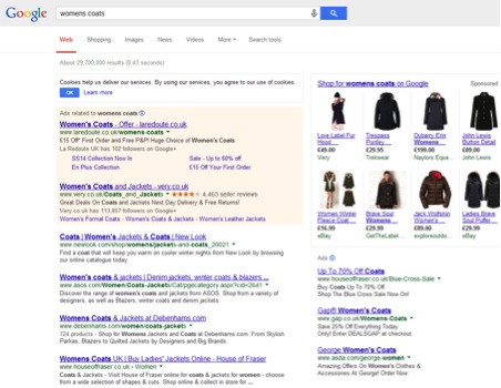
The new layout includes a slight variation in the font to a bigger, more rounded typeface. It might be an attempt to match the clean sans-serif fonts we see in contemporary designs everywhere, and it does seem to appear more welcoming (though the changes have been met with poor reviews). Secondly, search results are no longer underlined, allowing for free-floating text that only underlines when you hover over a prospective link.
Before
After
![]()
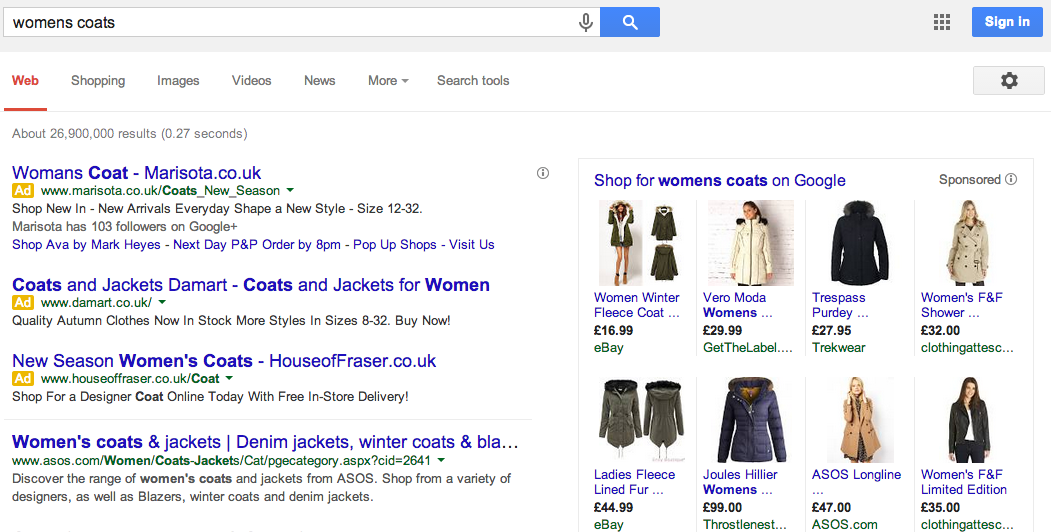
The presentation of paid AdWords ads has changed too. The original yellow shading to highlight the ad has been replaced with a small, relatively discreet ‘Ad’ marker next to the URL. There have also been very small changes to the presentation of images and other rich snippets.
Before
After
These changes may sound seriously underwhelming and minor, but the effect they have on the practice of SEO and PPC is significant.
The Good News
Whilst there has been a small, digitalized uproar about the changes, Google state that the design alterations are to benefit readability across each of our platforms. Whether a tablet or iPhone, the text is said to appear cleaner.
The other potential good news is that, because of the variation in the presentation of AdWords Ads, they might see an increase in click-through rates for their integration into organic search results. The yellow shading may have put users off prior to the changes, but now this subtle integration might cause a greater interaction with PPC or paid ads.
The Bad News
Well, for starters the SEO-friendly meta-titles that you’ve been assigning to each and every webpage will need changing if they’re to remain optimized. The new, larger font means that the maximum number of characters for titles is now around 55 to 60 – and that isn’t many characters to say what you’ve got to say. Descriptions seem to remain untouched though. If you refuse to comply with the Google ruling you might just see negative effects in your click-through stats.
Having explored some of the arguments against the update, it seems some users are finding the larger font to be harder to read and scan when on a desktop. The larger font means more space is taken up, so less results are shown – bad news for the skim-readers amongst us.
Google will forever be dishing up updates to stir the world of SEO and digital marketing. But the Upperdog pack are always on top, so if you’d like help with your SEO, PPC or digital marketing strategy, get in touch with us!